UX Case Study · Rose Agenor
A peaceful mental wellness app designed to help users track, grow, and sustain their mental health, one nurturing habit at a time.
01: Overview
Mental health is easy to neglect when life gets busy. People want a simple, trustworthy way to track their wellbeing and build sustainable habits, but most tools feel clinical, complicated, or hard to stick with. Cerebloom was designed to change that.
Cerebloom gives users one calm, private space to log moods, set goals, access resources, and connect with therapists, everything they need to take their mental wellness seriously, without the overwhelm.
Most people don't have a simple, judgment-free way to track their mental health and stay consistent with self-care.
A calm, responsive app that brings mood tracking, habit building, therapy access, and wellness resources into one place.
Adults aged 20–50 looking for an approachable, private tool to support their mental health journey.
Easier access to mental health tools, stronger daily habits, and users who feel genuinely supported, not overwhelmed.
02: Research & Discovery
Before designing a single screen, I needed to understand who Cerebloom was really for. I conducted remote interviews with three participants aged 20–50, asking 10–15 questions about their mental health habits, attitudes toward seeking help, and experiences with wellness apps. Findings were synthesized through affinity mapping to surface the patterns that would shape the product.
Participants ranged from ages 20–50 and were interviewed with a structured set of questions covering mental health attitudes, app habits, and barriers to care.
Topics included trust, data privacy, personalization, cost concerns, and what would make a mental health app feel genuinely useful and safe.
Interview notes were grouped into observations, positive feedback, pain points, and errors, then prioritized using Jacob Nielsen's heuristic scaling.
Moderated remote interviews, followed by collaborative affinity mapping. Insights were then prioritized using Nielsen's heuristic evaluation framework to determine which problems to solve first.
Users don't just want a tracker, they want to feel understood. Every feature in Cerebloom was shaped by the real needs, fears, and hopes that surfaced in these conversations.
03: User Personas
Based on patterns surfaced through user interviews, two distinct personas were developed to represent Cerebloom's core audience. Senya and Gabriel come from very different backgrounds, but both reflect a real, underserved need for mental health tools that are flexible, inclusive, and genuinely trustworthy. Every design decision was checked against their goals and frustrations.
Senya is a Vietnamese immigrant who moved to the US at age 2. Highly intelligent and analytical, she's also prone to overthinking. She's struggled with anxiety and depression for most of her adult life, especially after losing her mother. Married with two young children, she juggles a demanding career with family life, leaving little time for herself. Traditional therapy hasn't worked for her schedule, and she's motivated to find support on her own terms.
Find tools to manage anxiety and depression, build community and connection, and work toward greater peace and overall wellbeing, for herself and her family.
Feeling disconnected from past therapists, never having enough time for herself, and apps that don't allow for personalization.
Gabriel is a queer, Black, Puerto Rican artist born and raised in New York. Growing up in a community where mental health was rarely discussed, often seen as weakness, he's navigated insomnia, social anxiety, and panic attacks largely on his own. He's always found it helpful to talk to friends, but is ready to try therapy. He wants an app that feels inclusive, connects him with a therapist who understands his background, and gives him daily tools to manage his mental health.
Connect with a therapist who shares or understands his background, access anonymous support groups, find motivational content, and become more comfortable in social settings.
Apps that feel exclusive or lack outside resources, expensive subscription models, and platforms that don't reflect or respect his identity.
04: Wireframes & Prototypes
With a clear picture of who Cerebloom was for, I moved into structuring and building the product. The process was deliberately iterative, each step informed the next, from understanding how users think about the content all the way through to a fully realized high-fidelity prototype.
Starting with the research findings, I built out user personas and mapped task flows to understand how each user type would move through the app to accomplish their core goals.
I asked participants to organize Cerebloom's content and structure using closed card sorting. Their input directly shaped a site map that visualized every page needed for Cerebloom to perform its basic functions.
Using the site map as a guide, I sketched low-fidelity screens with pen and paper. This fast, low-stakes approach let me explore layout and structure before committing to any digital tool.
Hand-drawn screens were translated into clickable mid-fidelity wireframes in Figma, detailed enough to test with real users, flexible enough to iterate quickly based on feedback.
I conducted moderated remote usability testing with six participants. Feedback was captured on sticky notes and organized into four affinity map categories: observations, positive quotes, negative quotes, and errors.
Using Jacob Nielsen's heuristic scaling method, I prioritized feedback and developed targeted solutions. Those solutions guided the final high-fidelity prototype, a fully branded, production-ready design.
05: Usability Testing
Using the mid-fidelity prototype, I conducted moderated remote usability testing with six participants who matched Cerebloom's target audience. Sessions began with open-ended questions asking participants to walk through the onboarding process and describe what they thought the app's main purpose was. From there, each participant was asked to complete three core tasks.
All sessions were conducted remotely with moderation. Participants matched Cerebloom's target demographic, adults seeking accessible, stigma-free mental health support.
Key Finding
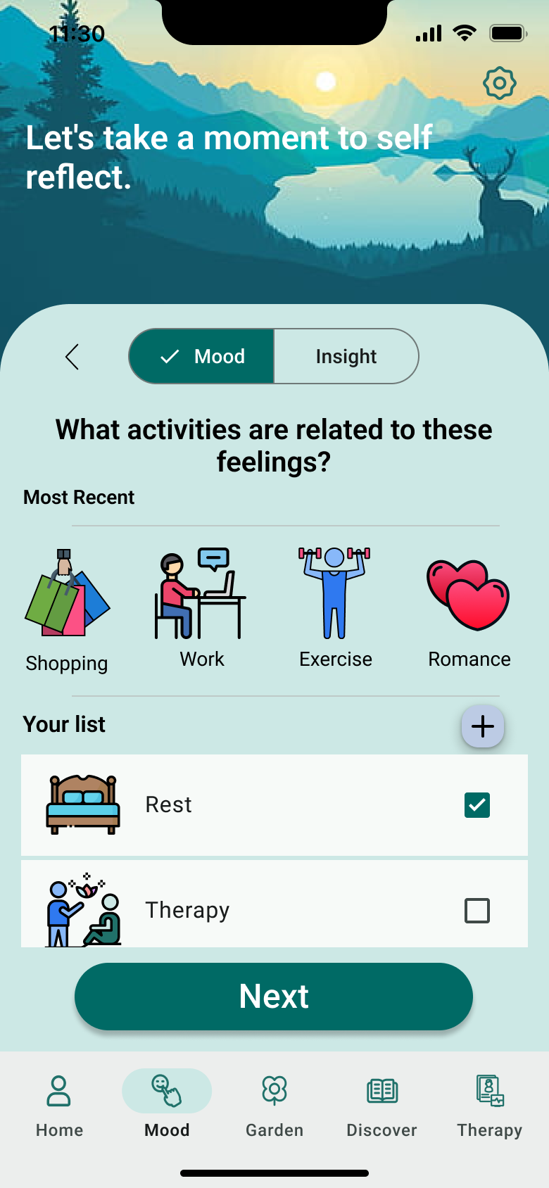
6 out of 6 participants found selecting moods and activities by icon alone confusing. Labeling all emoji and activity icons became a top priority fix.
Participants expected resources after selecting a therapist to be about that specific therapist. Several were confused by the share option under mood, and most assumed reminders were app-generated rather than user-created. Many clicked the therapist name/icon expecting it to be a link.
Participants consistently described the app as easy and straightforward to navigate. The daily affirmation on the dashboard was highlighted as a standout moment. Users loved the challenge and reminder features, the journal after mood tracking, the goal tracker progress bar, and the breadth of resources available.
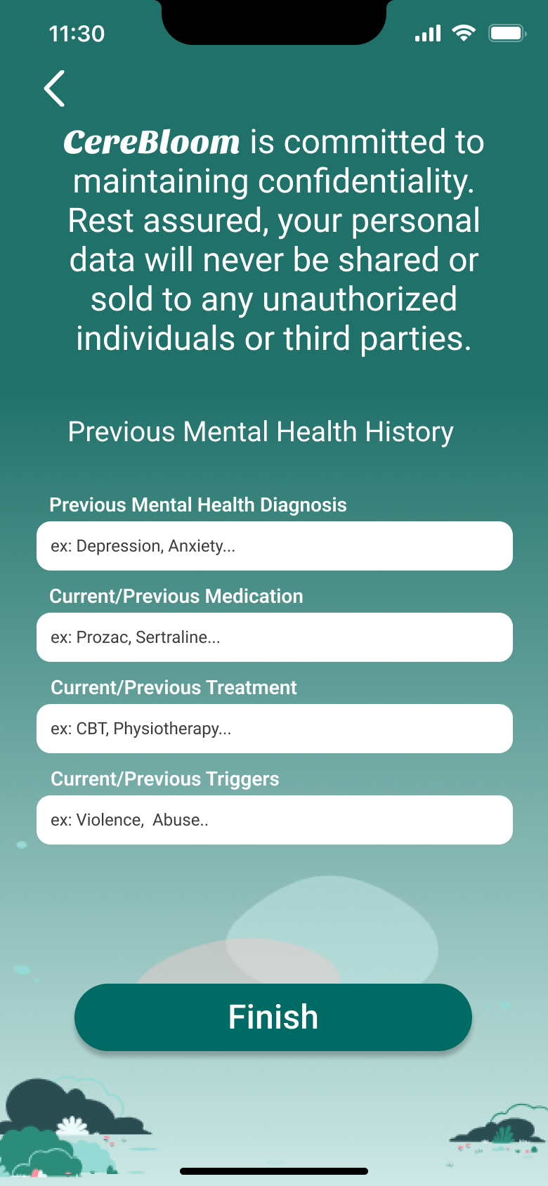
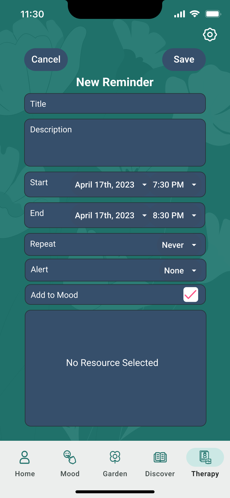
The onboarding form felt long, though necessary. Mood and activity icons needed labels. The "Add to Mood" label under reminders was unclear. The favorite and schedule buttons on the therapy screen were too small and too close together. Users also flagged a missing confidentiality statement during sign-up.
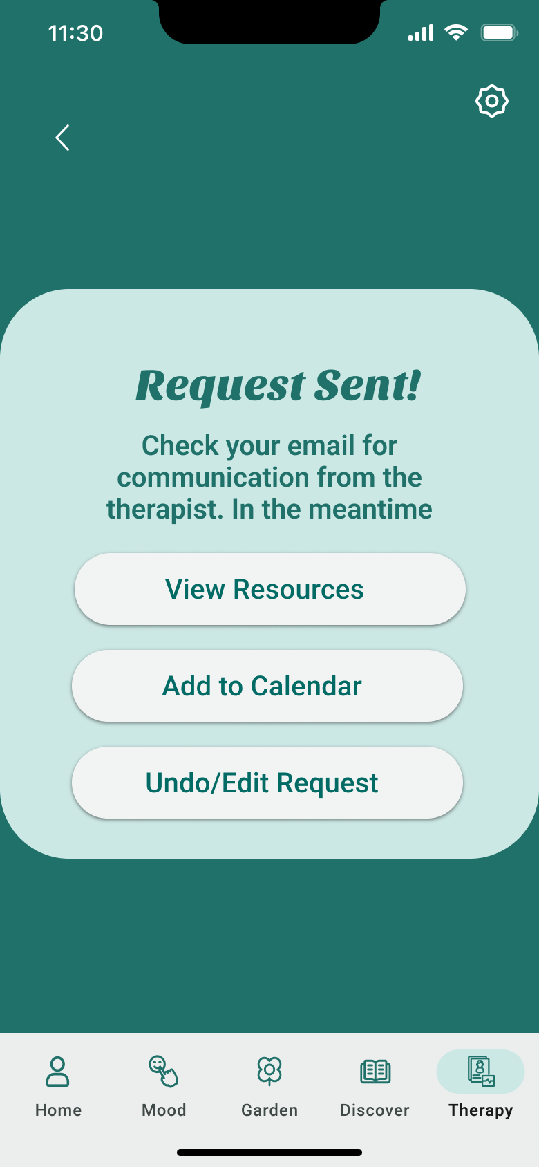
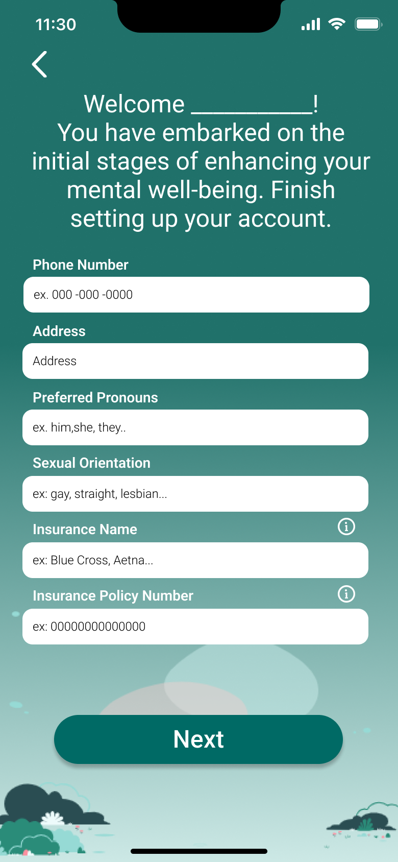
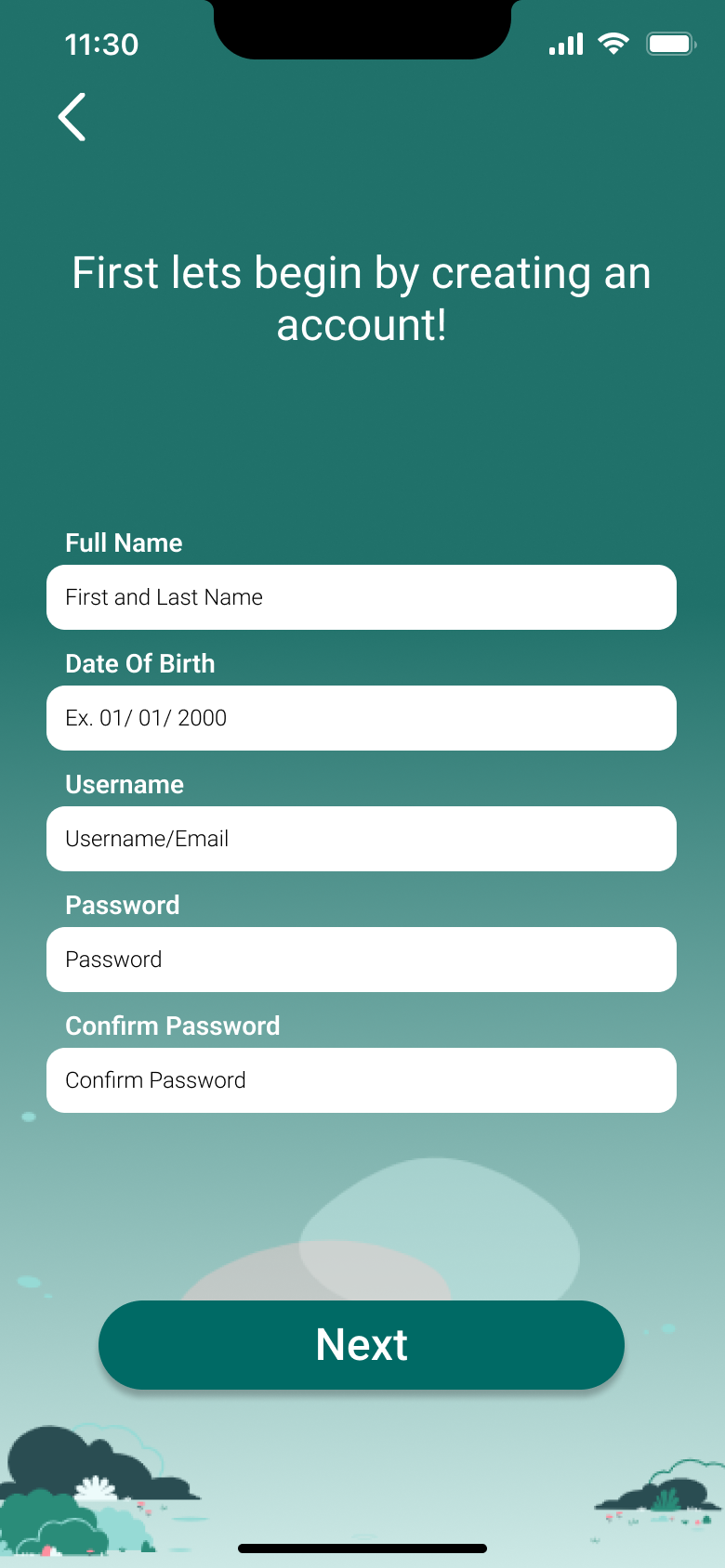
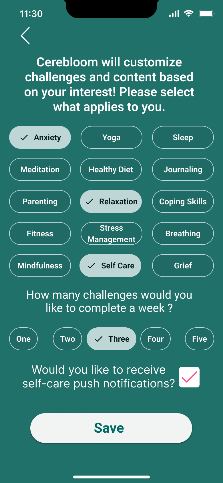
Mood emojis and activity icons were labeled. Onboarding was restructured into a 3-page intake form with transitions to feel less daunting. A confidentiality clause was added at the start of sign-up. The schedule button was enlarged and the favorite button repositioned. Therapist names and icons were made tappable.
06: Visual Design & UI
Once all usability issues were addressed, focus shifted to the visual design system. A set of design guidelines was created to capture the essence of Cerebloom as a brand, ensuring consistency, accessibility, and warmth across every screen.
Green is the primary color used for navigation bars, backgrounds, and most buttons. Pink is reserved for small details, links, and error states. Blue serves as a secondary button and card color.
Inclusive, friendly, and inviting. Language is encouraging, honest, and clear, no clinical jargon. Users should feel comfortable trusting Cerebloom with their mental health journey.
A mix of human-focused photography and colorful floral illustrations. Background images layered at ~20% opacity (Luminosity mode) maintain brand warmth without overwhelming content.
07: Final Solution
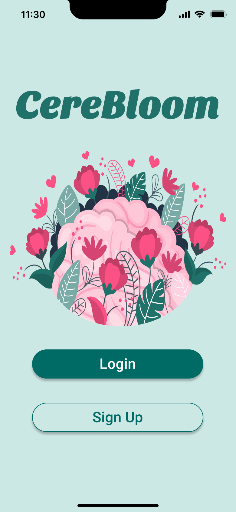
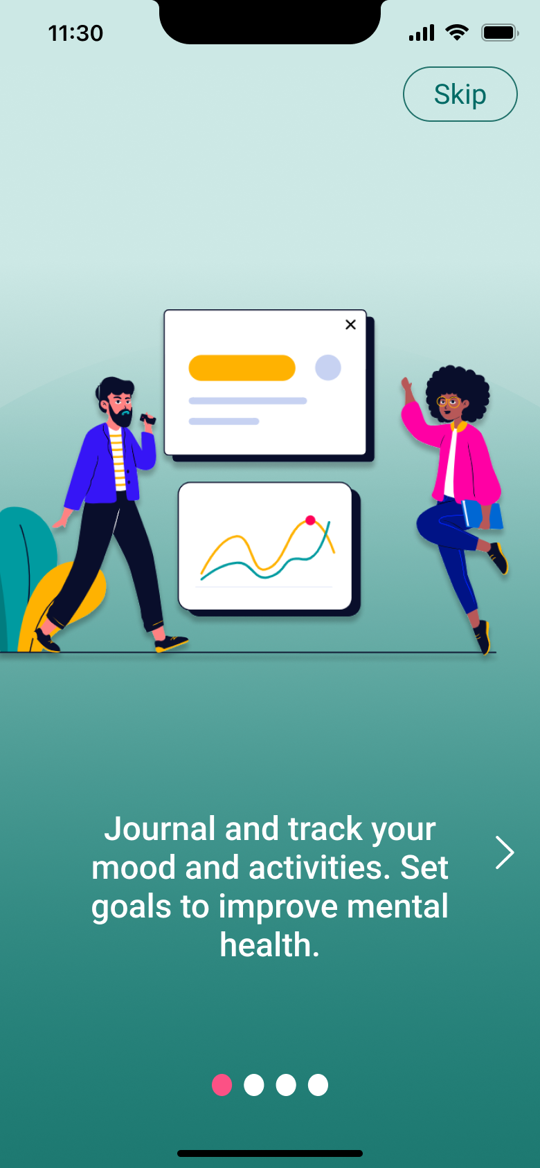
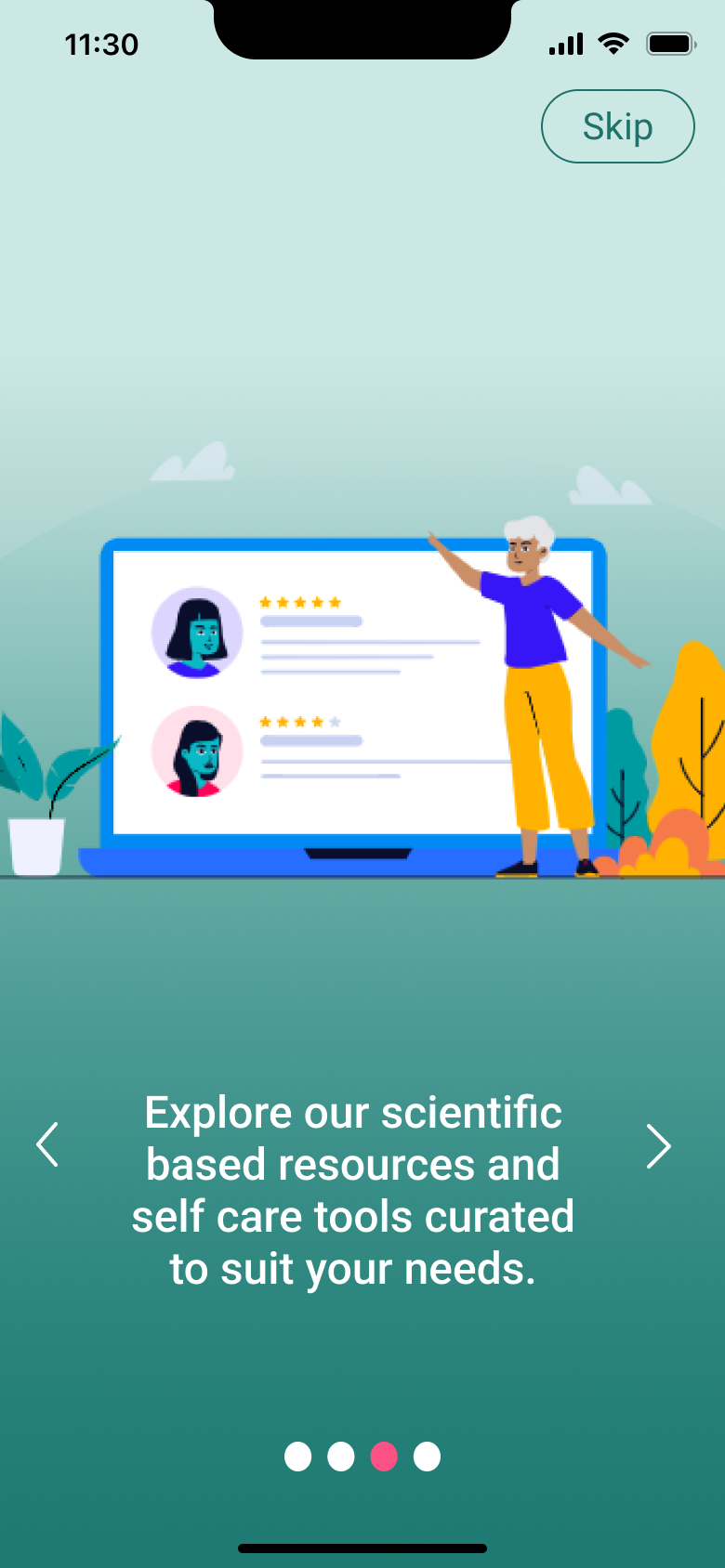
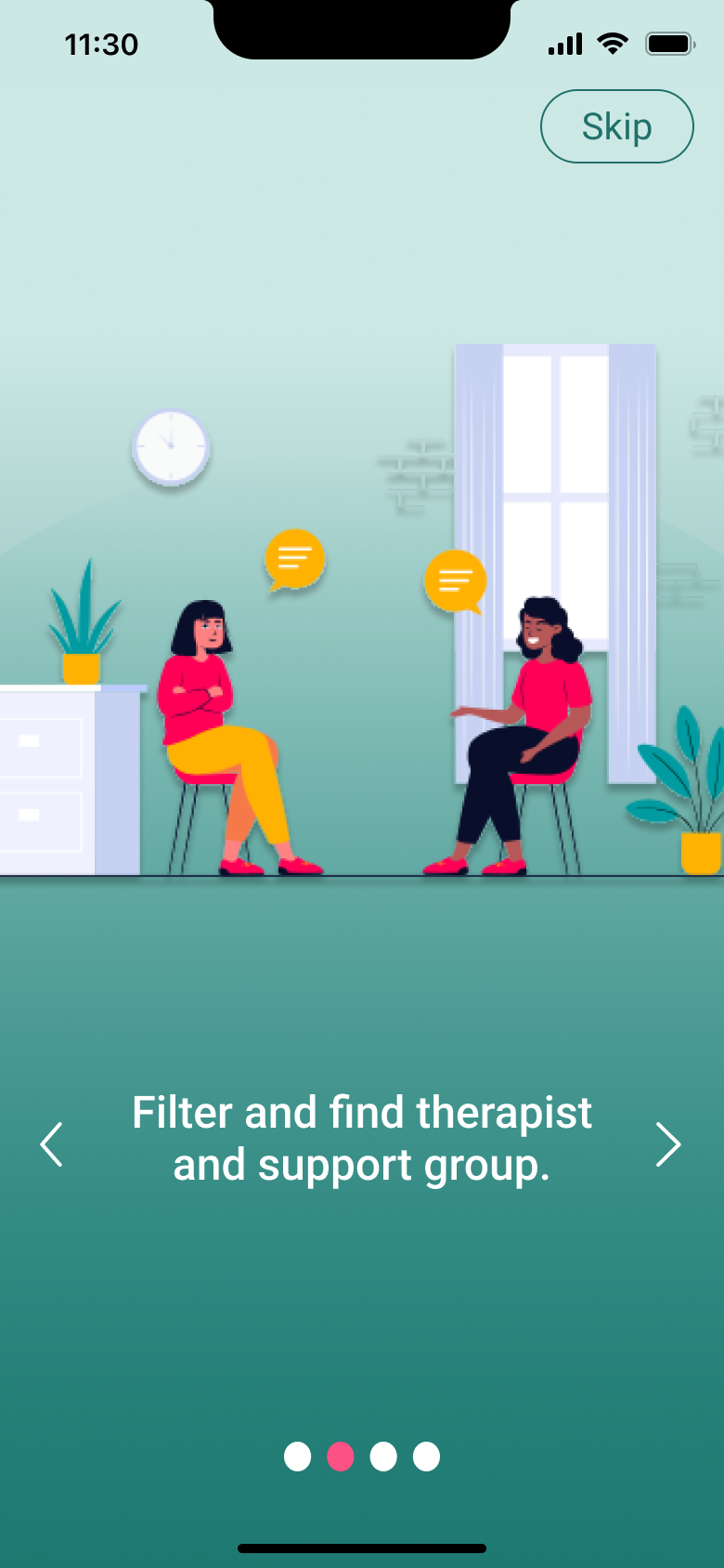
Cerebloom was designed with a mobile-first approach. While a high-fidelity prototype of the desktop home screen was explored, the primary focus, and all usability testing, was conducted on the mobile experience. The final prototype brings together every research insight, user feedback, and design decision into a cohesive, accessible product that feels as good as it works.
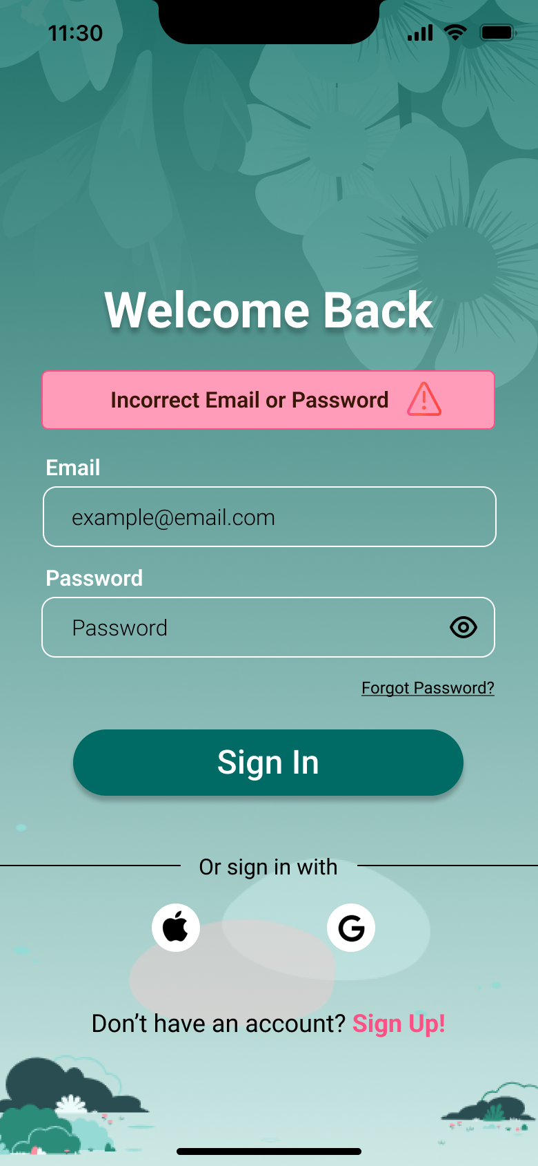
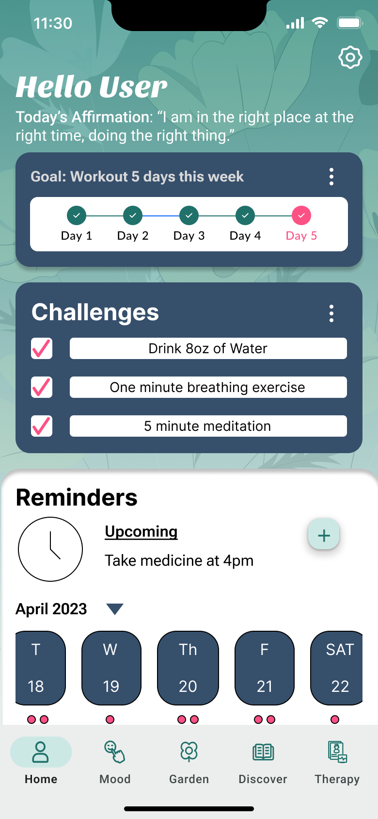
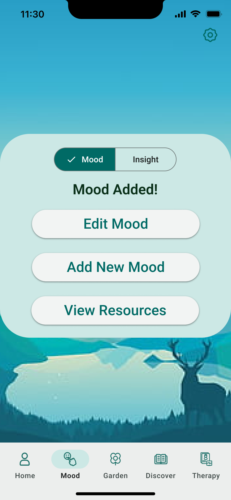
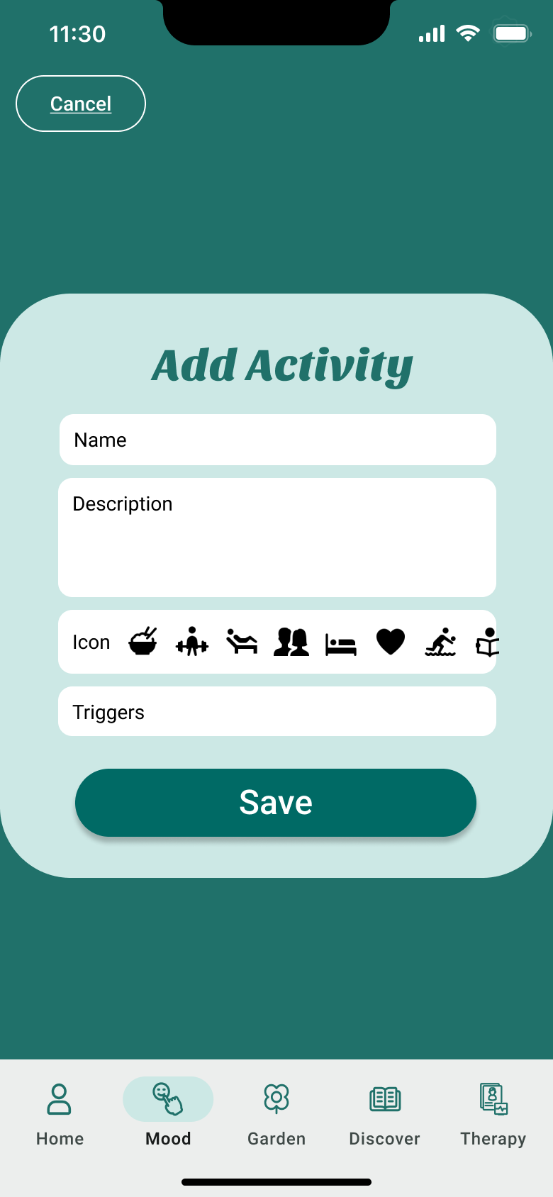

Daily micro-challenges like drinking water, breathing exercises, and meditation keep users engaged with small, achievable wins.
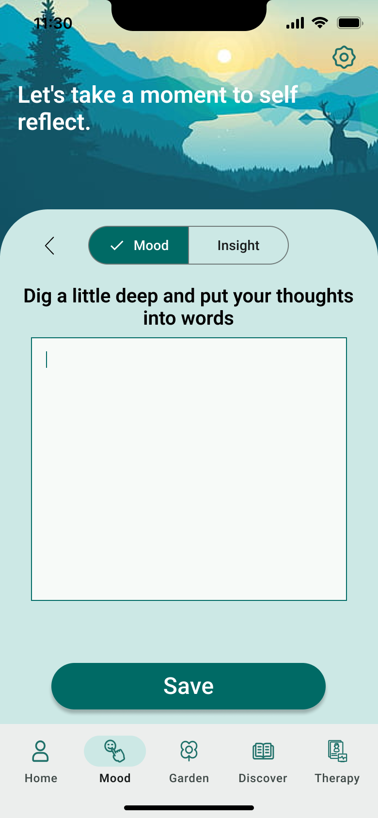
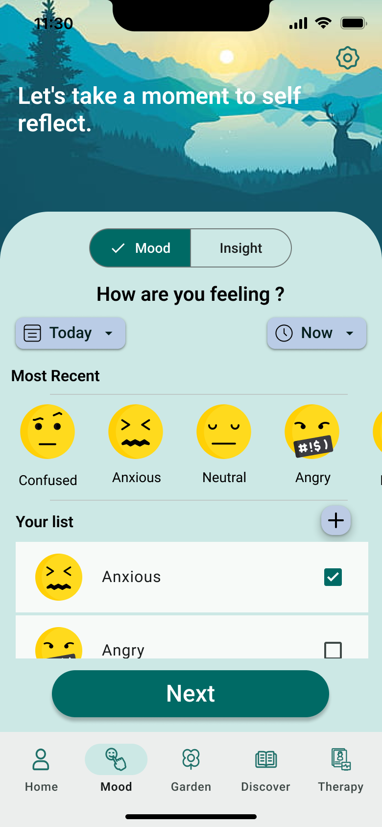
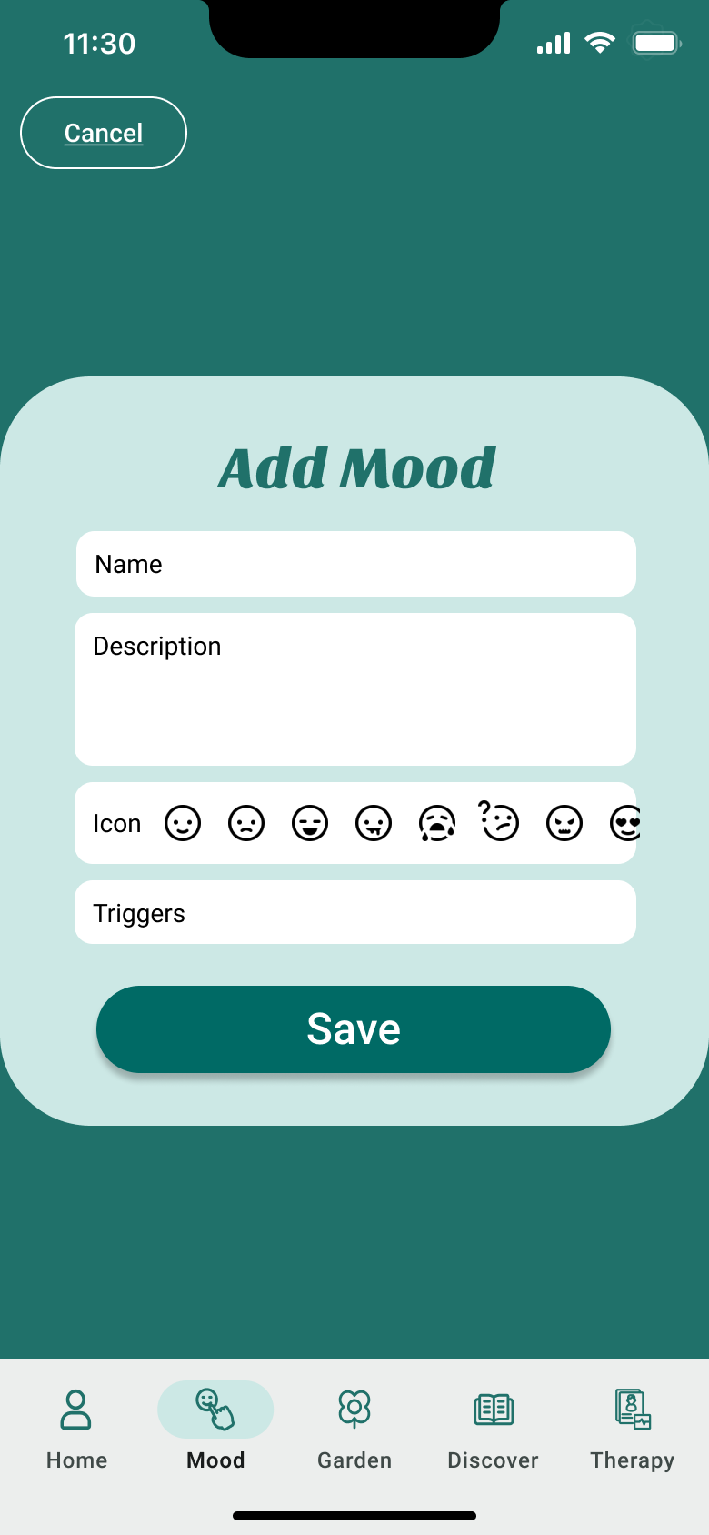
An intuitive emoji-based check-in captures emotional states across a spectrum, Confused, Anxious, Neutral, Angry, Happy, Sad, making logging feel natural and low-pressure.
Visual progress indicators for personal goals give users a clear, motivating sense of how far they've come.
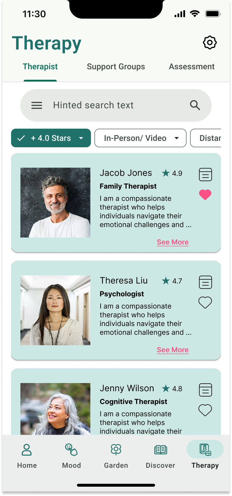
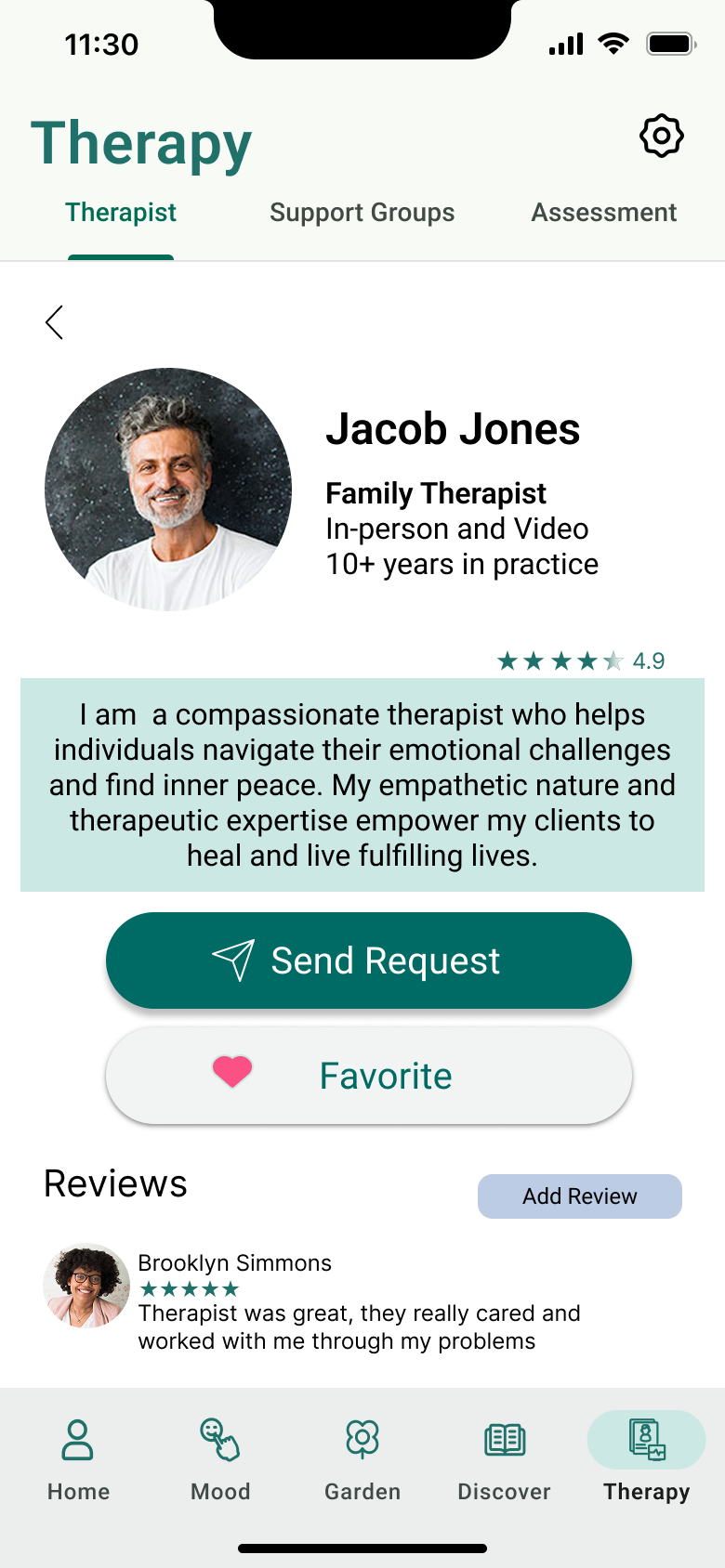
Users can find and connect with therapists that match their needs, schedule, and preferences, putting the power of choice in their hands.
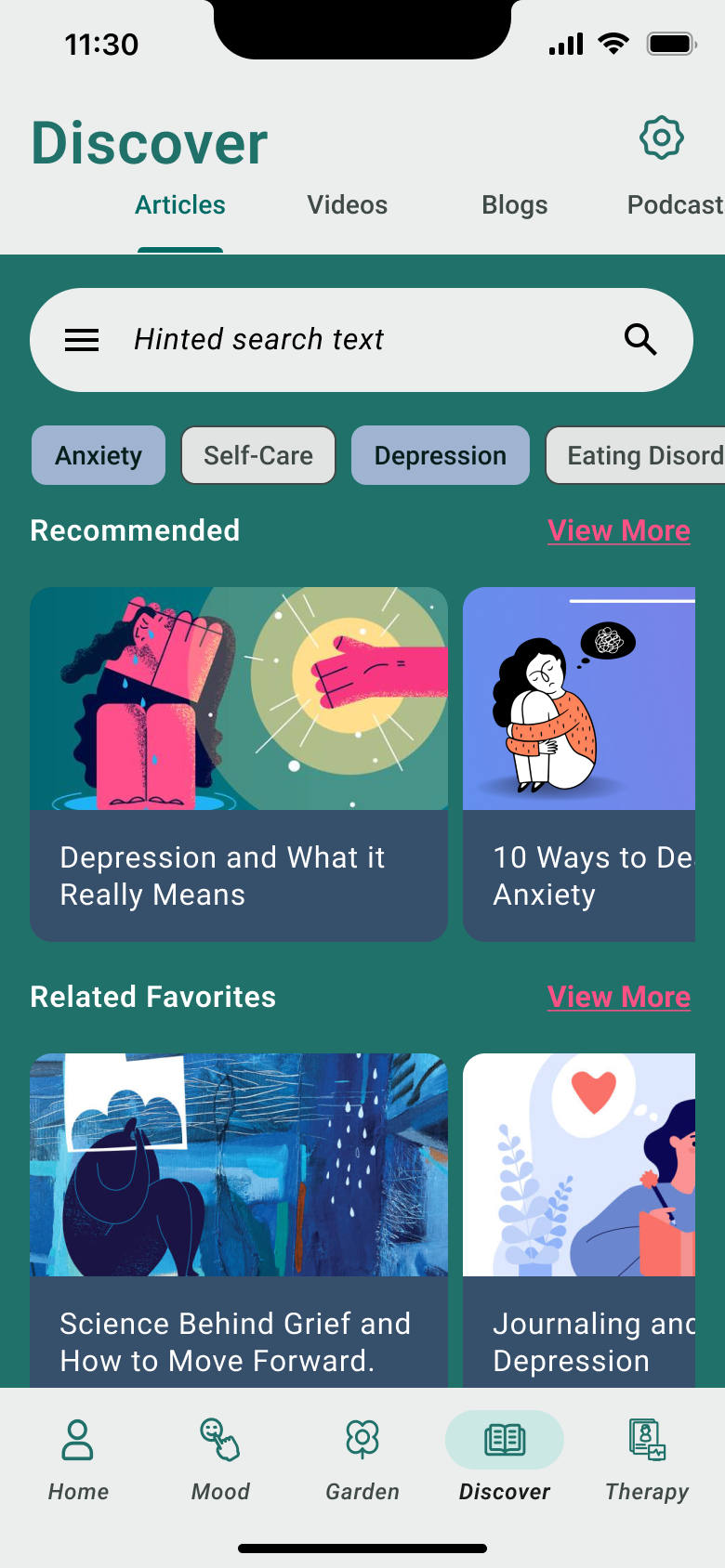
Curated articles, podcasts, and playlists surface relevant, research-backed content to support learning and self-care between sessions.
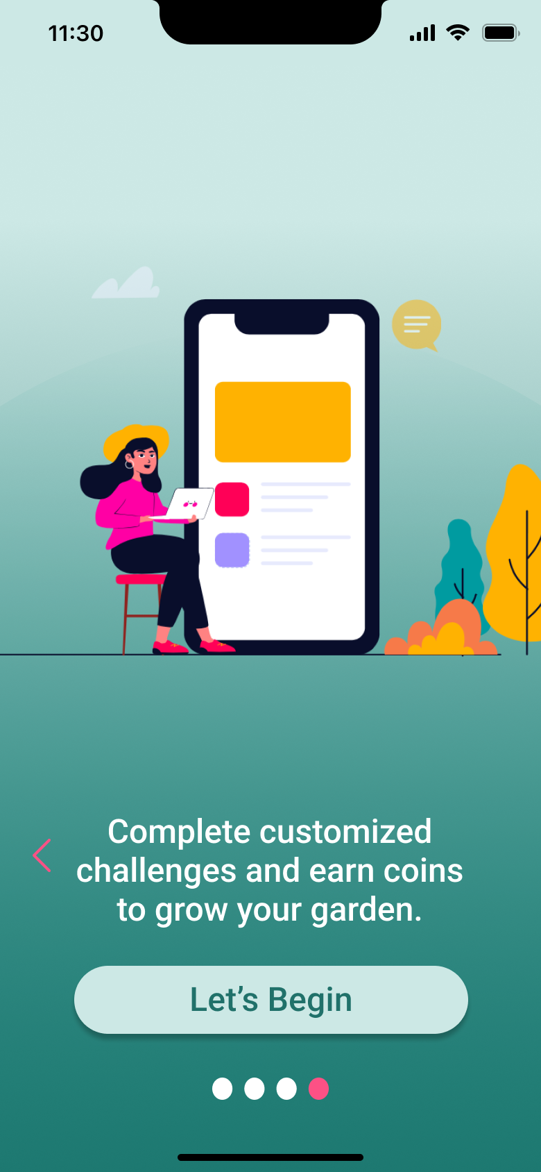
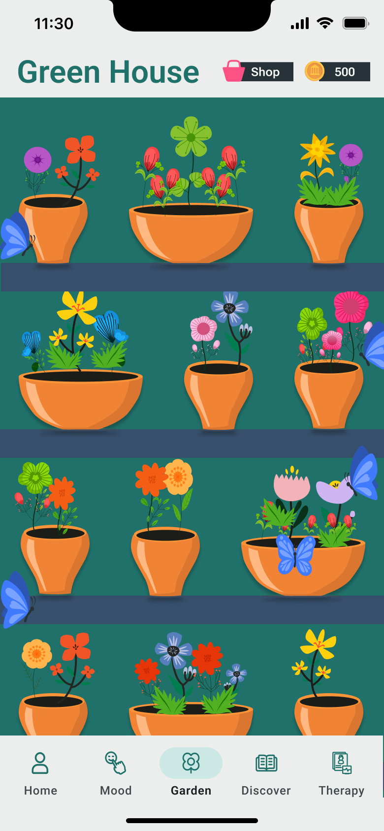
Users earn coins by completing daily challenges and can spend them in the Green House to grow and collect a personal garden of plants and flowers, making self-care feel rewarding and fun.
08: Reflection & Learnings
Cerebloom was my first major UX project, and it confirmed something important about the kind of designer I want to be.
"My background is in Biology, but UX gave me a new way to pursue the same goal, using knowledge and empathy to improve people's lives. Cerebloom showed me that good design can educate, empower, and motivate. That's the kind of work I want to keep doing."— Rose Agenor, UX/UI Designer